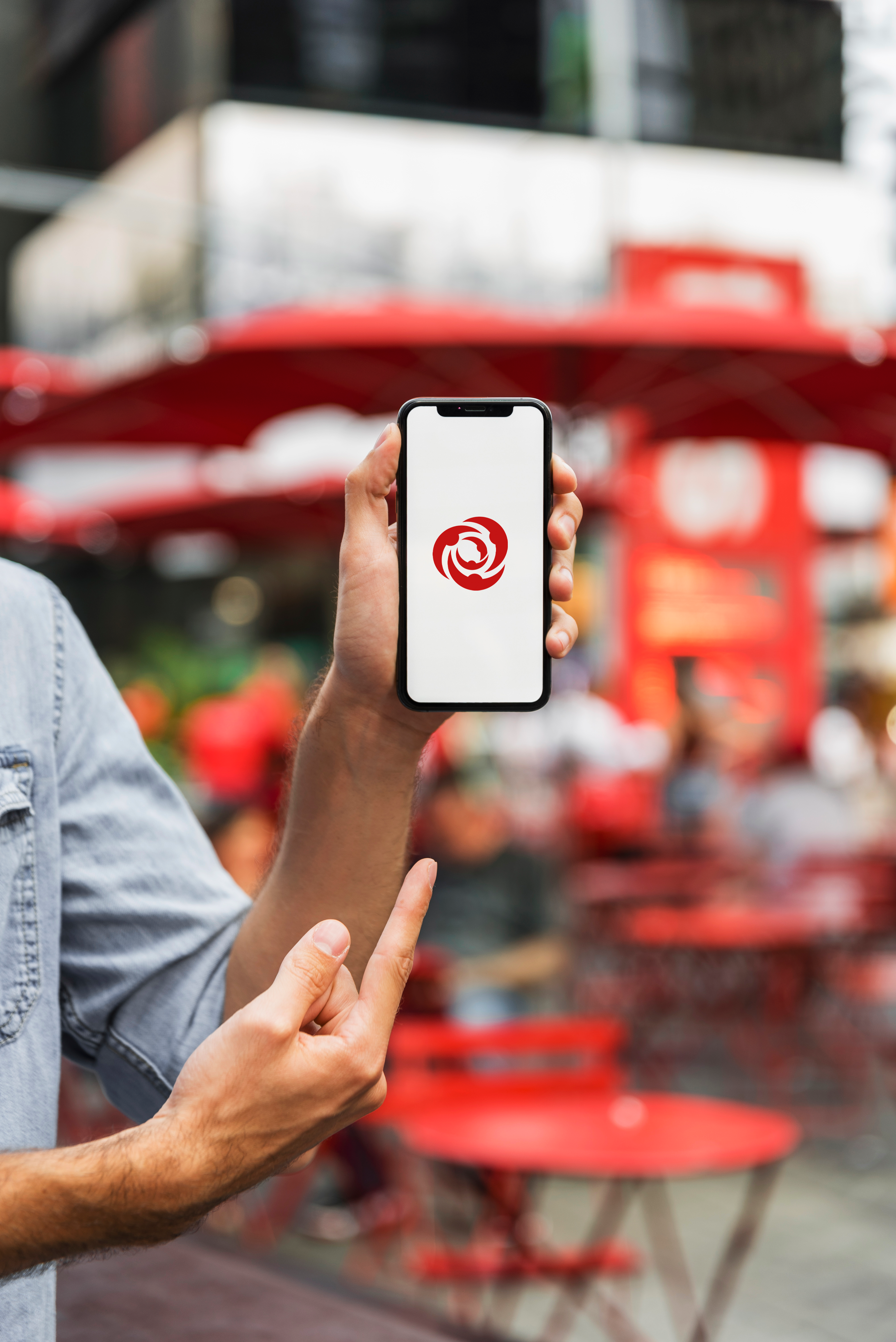
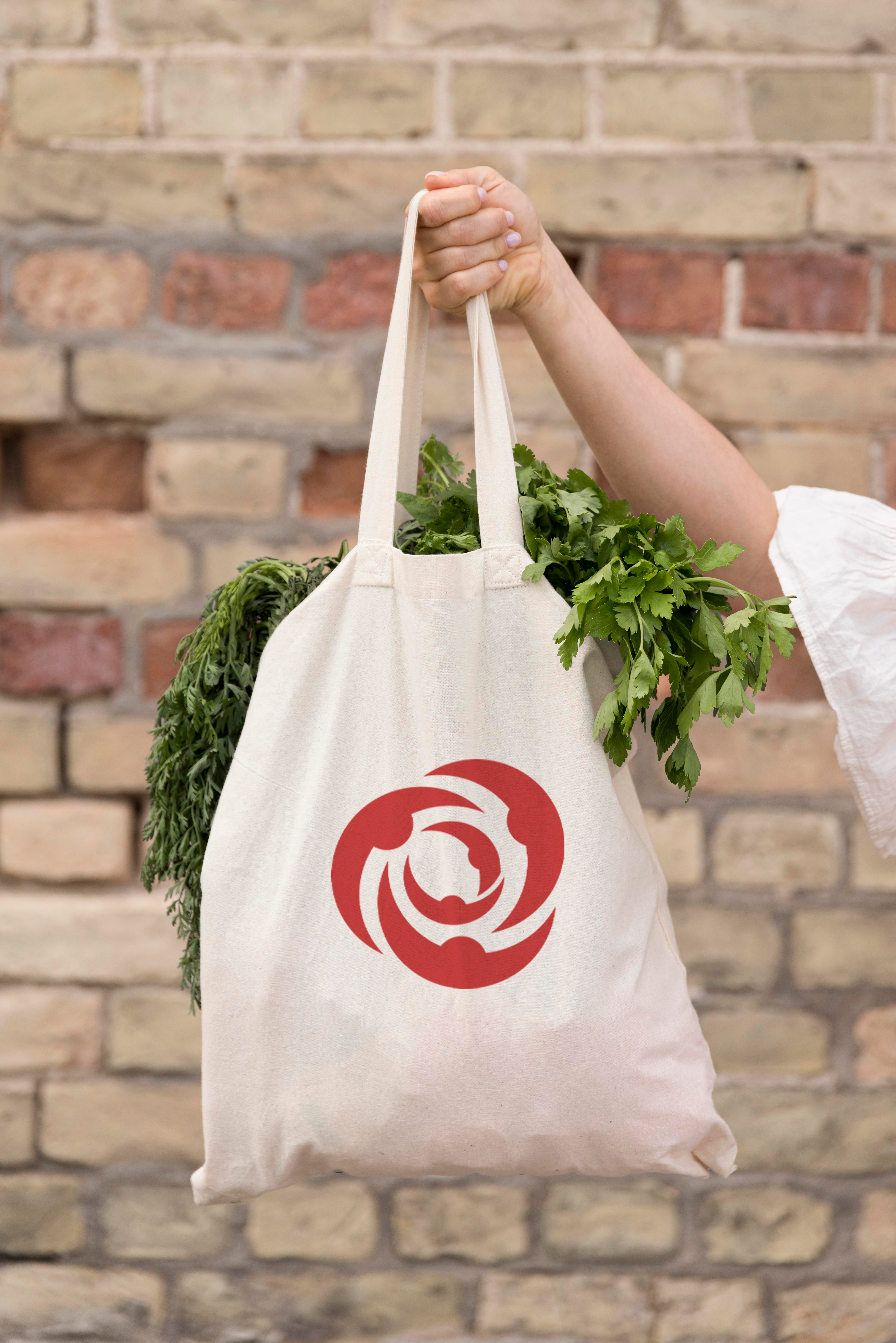
This project was for a client in 2021 who owns a supermarket in Cyprus. The Triantafillos Supermarket logo is a heartfelt representation of familial unity and collaborative spirit, echoing the very essence of its name, which translates to "rose" in Greek. Rooted in the rich symbolism of the rose, a timeless emblem of love, unity, and growth, this logo embodies the close-knit bond shared by the Triantafillos family and their dedicated team.

At the heart of the design lies a beautifully stylized rose, its vibrant red petals unfurling to form a circle, symbolizing unity and togetherness. Upon closer inspection, the individual petals reveal silhouettes of people, their graceful forms intertwined in a warm embrace, reflecting the spirit of teamwork and collaboration that defines the Triantafillos Supermarket. The choice of red as the predominant color pays homage to the majestic beauty of the rose, while also evoking feelings of passion, vitality, and warmth. This hue not only captures the attention but also exudes a sense of vibrancy and energy, mirroring the dynamic atmosphere of the supermarket and its bustling community.

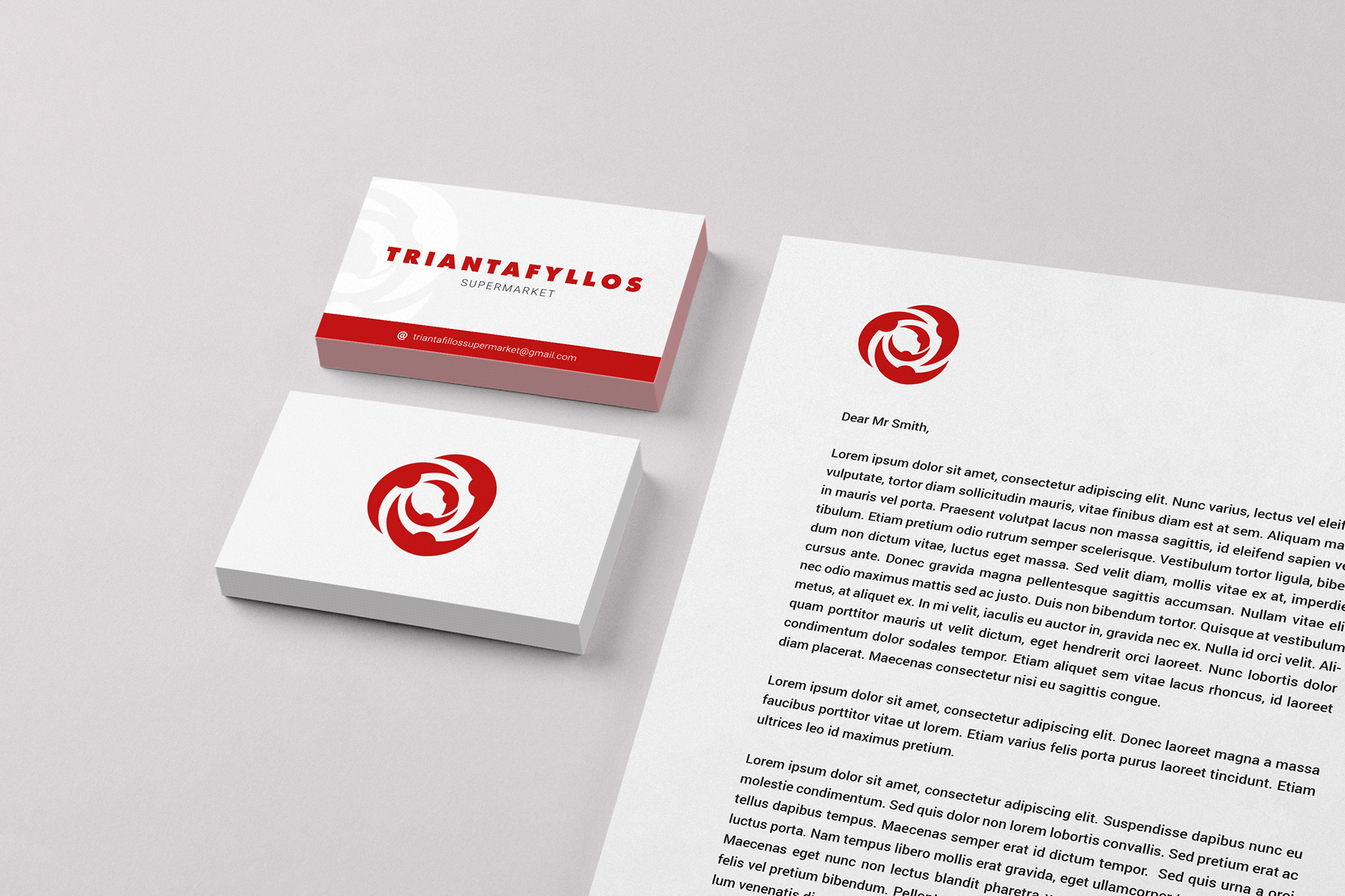
Commissioned in 2021 for a client with a supermarket in Cyprus, this logo encapsulates the values of tradition, unity, and collaboration that have been the cornerstone of the Triantafillos family's success for generations. As a visual representation of their commitment to excellence and customer service, this logo serves as a beacon of hospitality and inclusivity, inviting patrons to become part of the extended Triantafillos family.
With its elegant design and profound symbolism, the Triantafillos Supermarket logo stands as a testament to the enduring power of family and teamwork, inspiring both employees and customers alike to embrace the beauty of community and shared endeavor.